-
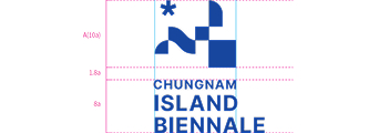
Meaning of the Symbol Mark
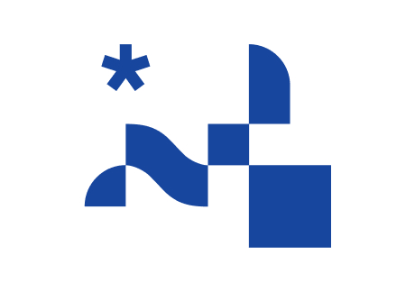
The overall form of the symbol mark embodies the Korean word and character “섬 (seom),” meaning "island," effectively reflecting the identity of the nation’s first biennale themed on islands and the global trend of K-culture. Reflecting the Island Biennale’s key feature—art exhibitions held across multiple islands—it renders shapes of “fragments (islands) of art” and “waves.” The connected fragments signify a single culture and art formed by diverse pieces (island arts) coming together. The “star” at the upper left visualizes both the shining value of such culture and art and the initial for Chungnam (ㅊ), evoking the mystery and wonder of island art. In particular, as exhibitions are enjoyed while moving from island to island, a sail element symbolizing voyage and journey is accentuated within the lettering to strengthen distinctiveness.
-
Symbol Mark Usage Restrictions
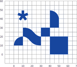
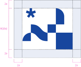
As a rule, the symbol mark must be reproduced using digital artwork. For large sizes that cannot be output digitally, it must be drawn precisely in accordance with the grid provided in this section. The minimum clear-space rule sets the minimal area to prevent visual interference from other elements when using the mark.
- Grid System
- Clear Space Rules
- lear Space Examples
- Grid System
-
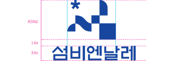
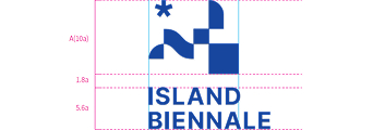
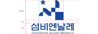
Signature
The signature is a design element that combines the symbol mark and logotype in optimal proportions, building the brand identity and forming a cohesive image. The appropriate signature must be used by medium, and the prescribed rules for combining elements must be strictly observed.
Horizontal Logo Signature (Korean / English)- Korean

- English A

- Korean / English
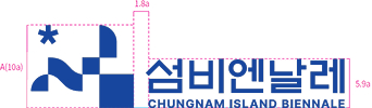
- English B

- Korean
- English A
- Korean / English
- English B
- Korean
-
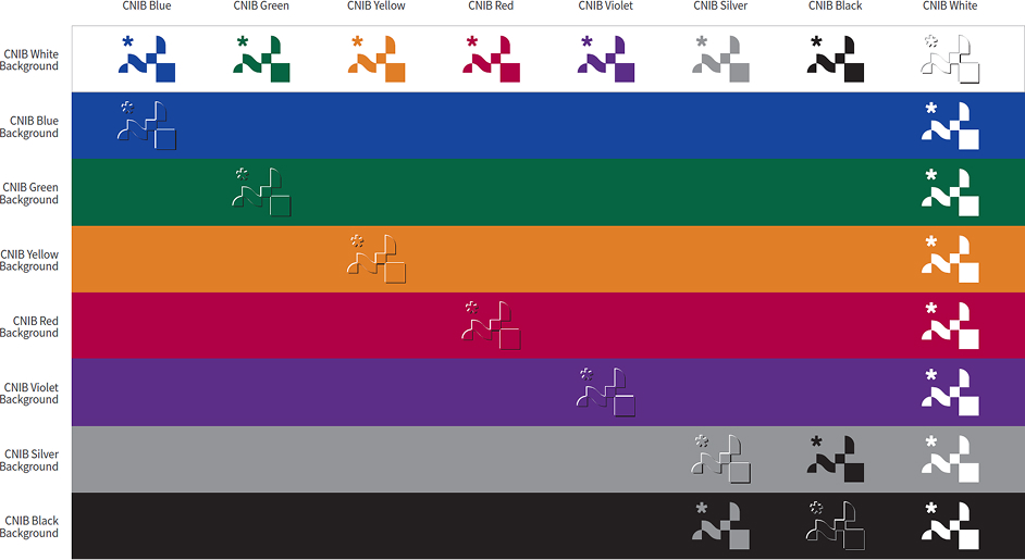
Designated Colors
Because the symbol mark conveys the brand image across visual media, consistent color representation is essential. Careful attention is required for effective color use; when in doubt during production, consult the responsible department.
Main Color- CNIB Blue

Sub Color- CNIB Green

- CNIB Orange

- CNIB Red

- CNIB Violet

Gray Scale- CNIB Black

- CNIB Gray

- CNIB White

- CNIB Blue
-
Color Application
When applying the symbol mark, ensuring clarity and legibility is crucial; the greater the luminance contrast with the background color, the more vivid the mark appears. The preferred background usage is to render the designated colors on a white background; various background colors may be used within a range that preserves the brand image. Where background colors exist, use CNIB White as the base when applying colors other than full color. For other background colors, consider the mark’s legibility and color combinations when applying it. Embossing or debossing is possible on all background colors.
섬비엔날레
Recent Searches
Delete All
Hot Searches
BI/Brand


Chungnam Island Biennale
204 Daecheonhang-ro, Boryeong-si, Chungcheongnam-do, 33489
Inquiry
Mail info@islandbiennale.or.kr
Phone +82-41-930-1408
Press and Media Inquiries
Phone +82-41-930-1416
©2025 Chungnam Island Biennale. All Rights Reserved.